Subtotal: $0.00 Cart

  • the source of our inspiration


    premium, archival fine art inkjet papers wrapped in the intimacy of a rural culture

    @Jenniferking_photographer
  • Free MOAB classes


    videos and livestreams released weekly

  • juniper baryta rag


    our best reviewed and most award-winning paper yet

Artworlds: Digital Art by Jonathan Morse

ARTWORLDS 3 © Jonathan Morse 2016, 24" x 36" limited edition pigment print on Moab Juniper Baryta Rag

ARTWORLDS 3 © Jonathan Morse 2016, 24" x 36" limited edition pigment print on Moab Juniper Baryta Rag

Jonathan Morse created six 24"  x 36" Moab Juniper Baryta Rag prints, up now at Currents New Media 2017, a month-long international festival of new media in Santa Fe, New Mexico June 9-25, 2017.

The prints depict Earth-like spheres that appear to be unraveling or recombining, worlds composed of various designs and colors and overlaying a moiré background pattern. Morse is showing six of a series of eight prints. “They’re about how we create our own art worlds within and without,” he said. In a statement about the work, he talks about how the digital age has made us all editors and directors of our own lives, curating the version of ourselves we present to others through our online profiles. “To understand today’s world requires knowledge of editing techniques that do not remain static and without which we may not know what is going on around us outside our analog selves,” he writes. “Our re-mastered digital constructions now serve as objective correlatives of our inner experience. To repurpose the oft-spoken moviemaking term, we now can fix our lives in post.”
— Santa Fe New Mexican

Read the full article by Santa Fe New Mexican or find more at Currents New Media 2017.

Selling Fine Art Prints

As fine art printing has become easier, more affordable and of higher quality, professionals and amateurs alike are trying their hand at showing their images on paper. At some point, even an amateur might be asked if he or she would be willing to sell a print. That has happened with a number of my amateur photography clients, whose next question to me is how they can sell even more prints.

As a Moab Master photographer, I was curious about the state of the art of selling fine art prints, so I decided to query some of my fellow Masters about their experiences in today's highly competitive marketplace. 

A Problem of Acceptance

Jim Graham is a well-respected generalist photographer from Delaware. Graham has wide ranging experience as a newspaper, editorial, wedding and commercial photographer, although his personal work tends to be more in the fine art realm.

"I find the biggest challenge we face is getting people to understand the value of photography and that it truly is 'Fine Art,'" says Graham. 

My own studio also finds that challenge to be a real barrier at times. Unlike with fine art paintings, people often associate photographic prints with cheap chain store prints. They have little awareness of the amount of time, work and extraordinary expense that has gone into capturing, post-processing and printing a fine art photographic print on museum-quality paper, using archival inks in high-end printers. Most of our clients report that seeing (and touching) a fine art print is a paradigm-changing experience. 

Exposure 

For anyone selling fine art pints, professional or amateur, a key factor is getting enough exposure. Putting likely buyers in front of fine art prints is the name of the game. 

Scott Barrow, another Moab Master, is a location photographer shooting a wide variety of assignments. He owns a gallery in The Berkshires of Western Massachusetts, an area that draws as many as 500,000 visitors in the summer. Approximately 80% of his gallery sales occur then. "We have a short season for gallery sales," Barrow reports. "From November through May we have very little foot traffic."

The challenge of exposure is compounded for those who do not have the luxury of operating their own gallery. One solution is to have one's work represented by an existing gallery. "Selling prints is a continual struggle," says Graham. "Having your work in galleries is a huge help. It tends to legitimize the work as a piece of fine art."  

Not Just the Money

Despite the fact that all professional fine art photographers have to put food on the table, I have never met one whose sole - or even prime - motivation was financial. We all are hard-wired to creatively express ourselves through our chosen medium, no different than a fine art painter or sculptor. 

Graham puts it succinctly: "Selling fine art prints gives me the opportunity to show people another side of my passion for photography. Purchasing prints gives them an opportunity to support that work. The proceeds from the sales of that go back into funding trips and the costs involved in the creation of new work."  

"I love the process of making prints," Barrow adds. "To be able to print an image and hold it in your hands is very satisfying. It’s real. When that photograph is printed on Moab’s Entrada Rag Bright 300 it’s both a visual and a tactile experience. I also like seeing which images people respond to in the gallery. I enjoy sharing my stories with them."

The Internet Myth

If there is one myth that wrecks more photographic dreams than any other it is that all you need is a website to sell fine art prints. That is patently false. None of my colleagues, some of the best print-makers in the world, sell much of their work online. Graham, for example, sells only a small percentage online, but those prints aren’t signed or numbered. 

Scott Barrow sells roughly 10% of his work through his website. However, even in those cases it represents follow-up from people who have first visited his gallery.  

This makes perfect sense when a fine art print might cost anywhere from a few hundred dollars to several thousand. Most informed consumers want to experience the look and feel of a fine art print before committing to purchase.  

Most professional fine art print-makers use the Internet and social media for increasing visibility which, in turn, drives people to see our art in person. 

Tips From the Pros

Given the state of the  market for selling prints, what do professional photographer print-makers recommend to  increase sales of fine art prints? 

Do It Yourself. There is no substitute for taking the time and effort to create your own prints. After all, you created the image. Why not advance your vision all the way through to completion? 

Use Quality Materials. "Printing on fine paper and offering the best presentation in terms of mat and frame truly helps sales," advises Jim Graham. "I find that using Moab papers by Legion, in combination with Rising mat board, has help my sales and consistency of presentation a great deal." I agree. 

Meet and Greet. Surprising to many people, most art sales are the result of face-to-face contacts. "People like to meet the artist," says Scott Barrow. "I spend my summers in the gallery and my experience is that 95% of the prints that sell do so when I am in the space.  No one sells me like I do." 

Invest. Selling high-end fine art prints requires an investment in time, energy and money. Don't expect to be successful right out of the box, but also know that experience, good equipment and fine art papers (like Moab's) will eventually get you there. 


Les Picker is a Moab Master photographer. His studio and gallery is located in historic Havre de Grace, Maryland. Les leads photography workshops throughout the world. 


Portfolio Creation Workshop with Les Picker

May 20th and 21st 2017

A two-day workshop offered by Moab Master Photographer Les Picker and Master Printer Robert Boyer.

Register here. Limited to four participants. 

More about the workshop.

Learn the art of self-critique. Create a hand-made, cloth-covered, boxed portfolio showcasing ten of your finest images, offered in an elegant, state-of-the-art presentation and designed to advance your photographic goals.

Top Ten Takeaways From This Workshop

  • Two-on-one consultation with two experienced, successful, professional photographers to help you curate and edit your work

  • Assistance selecting and post-processing your best images

  • Fresh perspectives on your own work and how to make effective editorial decisions

  • Learn numerous strategies for dealing with your own editorial process

  • A weekend of considered dialog with other serious artists

  • Develop contacts for editorial assistance going forward

  • Experience the value of outside editorial input on your work

  • How the editorial process can shape your art

  • Ten archival prints professionally printed on Moab fine art papers, using state-of-the-art Canon printers.

  • Distinctive, cloth-covered portfolio box, hand crafted in the USA

One of the hardest things to do as a photographer is edit down your work to a cohesive collection of the best and most fitting images, whether it be to support a single theme, single project or the best representations of your work.

What serious photographer does not realize he or she needs to have a professional portfolio to show friends, potential clients, judges at juried shows, or to peruse for their own enjoyment?

In fact, a professionally curated portfolio is essential for success as a serious photographer. Images come alive when carefully selected, meticulously edited and printed on fine art, archival paper. Viewers appreciate the look and feel of museum quality prints.

Yet, in our experience we have found that the majority of photographers either do not have a portfolio to showcase their art, or the one they use is actually detrimental to their success. Unfortunately, photographic portfolios are often poorly planned, poorly curated, and even more poorly executed.

If you are a serious photographer, here is a chance for you to walk home with a beautifully hand-crafted, hand-printed, and carefully curated fine art portfolio that will show off your work to the highest standard in the industry today.

It's All About the Light... and Dark

by Les Picker
Images by Les Picker

I come from a lineage of photographers. As an immigrant my grandfather made his living by photographing people on the streets of New York - usually mothers and children - and selling them the black and white prints a few days later after he developed them in his home darkroom. I can still remember the magic of seeing those ghostly shapes begin to appear under the red light in his darkroom.

My father was an advanced amateur color photographer, and of his three brothers one was a portrait studio photographer, one a camera repair technician, and one a photo retoucher and graphic artist. As a child, I often would hear one of them acknowledge that the toughest photography of all was black and white. I didn't comprehend that then, but I've come to believe - evolved might be a better word- that B&W is the most difficult form of photography.

With color photography, you have... well... COLOR! There is little left for the viewer to imagine. What you see is what you see. I'm not at all saying that color photography is easy. Far from it. I photograph and sell color landscapes and wildlife prints all the time. But what color does is release you, the photographer, from the burden of having to interpret the scene for the viewer. Let me tell you, that is an enormous burden for the B&W photographer.

With B&W you do not have a color palette to work with. All you have are two things, light and shadow, black and white. Oh, yeah, and about a zillion shades in between. 

I have a theory about B&W photography and from my layman's readings in neuropsychology I think there is support for this. I believe that B&W imagery makes the brain work harder, both for the photographer and, more importantly for our viewers. And that very work is what engages the viewer, what forces them to confront the image. They have to delve a bit deeper, to decipher the tonality, to create a cognitive structure for it, all based on life experiences that scream COLOR!

Good B&W imagery also does not always give the viewer everything they need for a coherent reality. The side of a face put into deep shadow forces the viewer to create a visual structure for it that is consistent with their experience. They know the face is there, but...

B&W challenges the viewer to make sense of a uniquely nonsensical reality. We look at a color landscape and it makes perfect sense to us. Why? Because that is how we perceive it. Now take that same image in B&W and you are essentially creating an alternate reality that doesn't harmonize with the viewer's visual reality. Our world is full of color. It is rarely monotone.

 So what does the viewer actually have to do? How do they make sense of a B&W landscape? They have to work at it. They have to look deeply into it, discerning tones that indicate light and shadow. They must unconsciously imbue the image with a logical structure that transcends color. I believe it is that very engagement that bonds the viewer strongly to the image itself, whether in a positive or negative way.

That is why most people, when asked, tend to ascribe more "drama" to B&W images. That is why collectors are so passionate about B&W prints. B&W prints are not merely the representation of reality that confirms our daily perceptions. B&W prints forces people to dig into their own reality structures, and who ever knows what lurks in those depths? 

Our brains are a bouillabaisse of cognition, emotion, sensory inputs, memories, trauma and exquisite joy. When a viewer studies a B&W image, when they dig deep into their psyches to make it fit into some cognitive structure, who knows what else they might pull out? I suspect lots of emotions, memories, whatever. So what they see is not a simple scene. They see something with which they viscerally connect.

I am not saying that every B&W image does this, nor that no color images do it. Some B&W images are appreciated for simple things like their patterns or texture or scale, for example. But the really great B&W images are emotional, evocative. They may create instant dislike or passionate appreciation but rarely passivity. When I look at Dorothea Lange's B&W image of the Depression era mother with her two young girls' faces hidden in her neck, I feel empathy and sadness. In the same way, even as I took this image, I could feel the religious devotion of this man praying at Jerusalem's Wailing Wall.

As a novelist (check me out on Amazon...please!) I know that once I release a book it is no longer mine. In fact, that is what I pray for. I want my readers to figure out for themselves what the book means for them. I put my narrative out into the vast ocean of personal experience and expect them to fill the sails. 

The same holds true for B&W photography, at least to my way of thinking. I may know what the image represents, but that's only true for me. It's up to my viewers to interpret it for themselves. And I'm always humbled by what they see in it that I would never have imagined.

One final bias, and I say this admitting that I sell a lot of color prints. There is nothing in the photographic world like a B&W print. Period.

Storing Your Rolls of Fine Art Paper

by Lester Picker, Moab Master

www.lesterpickerphoto.com

As a Moab Master I'm asked every so often how our studio handles paper storage... lots and lots of paper. We are constantly testing papers for ones that meet our high standards (another reason we love Moab papers!). Boxed sheet papers are obviously no problem, so long as you have room and shelves to stack them. But roll paper presents different challenges. 

For years, as our fine art print business grew, we faced an increasing mess. Some of our roll papers we put back into the boxes they came in, while others we slipped into their plastic bags, and still others stood bare, ready to be used. As the variety of rolled paper types increased we sometimes got confused about which papers were which. We wasted time sorting through boxes to find the right paper and then wasted more time unboxing and re-boxing them. We also had a fair amount of damaged paper, which is a death sentence for a viable business. 

We finally tackled our roll paper storage problem once and for all. I'm not suggesting that our solution will work for you, but it sure works for us. 

We had a narrow closet that we already used for our pathetic version of roll paper storage. When I could take it no longer,  I cleared out all the papers and created the storage solution you see here. 

The Solution

If this solution looks good to you, here is all you need to get the job done. The entire installation took me just a few hours from start to finish.


  • Some 2 x 4s (the length will depend on how high you are willing to stretch and how low you're willing to bend to go to retrieve the heavy rolls). 2 x 4s are required because by standing out from the wall they allow enough room for the paper roll to fit between the hook and the wall. 
  • Screws (long enough to get through the 2 x 4, 1/2 inch sheetrock and into the stud behind)
  • Toggle bolts (if you cannot screw into studs, you'll need these to anchor the 2 x 4s)
  • Hooks (2 for each bar; you can get these at Home Depot; just make sure they are a sturdy kind)
  • 1-1/2" diameter wood dowels (each one should be 60" long if your maximum paper width is 44", or 48" long if your maximum paper roll width is 36"). I recommend that even if the maximum paper size you can print is 24" you not go less than the 36" paper width. The maxim in fine art printing is that you can never go big enough, and that 24" printer will soon be too small for you!
  • Drill
  • Drill bits
  • Hammer
  • Level
  • Tape measure


Tips

I'll let you figure out the steps needed to build this out. However, here are a few tips:


  1. Make sure that the interior distance between the 2 x 4s is long enough to allow the roll to fit, with an extra inch or two to prevent smashing your rolls when you mount them. In our case, the widest rolls we use are 44". However, we often use 24" rolls, so I set the distance between my 2 x 4s at 50" so I could mount two 24" rolls side-by-side.
  2. Allow enough room between hooks going down the 2x4 to enable you to hang the rolls without a hassle. I left 6" between the bottom of one hook and the bottom of the next. 
  3. I found it easiest to set all your hooks going down one 2 x 4. Then simply use a long level to place each hook's partner on the other 2 x 4. This will save you lots of time in measuring. If you do not have a long enough level, you can alternately use your straightest dowel with a level on top.
  4. Paper rolls can be heavy and you'll be mounting and removing them every time you need one. Make sure you secure the 2 x 4s and the hooks with adequate fasteners. 
  5. Allow plenty of room for the bars to overlap the hooks. I suggest 60" bars for hooks that are set 48-50" apart. 


Hopefully, this setup will cure your paper roll blues. Good luck!

Photoplus Brings on Power of Print


Booth 973

Learn from these Moab Masters all the great ways you can generate revenue from printing!


Thursday, October 20

12:30 Jim LaSala


Friday, October 21

11:15 Jim Graham


Saturday, October 22

Bring your file for a free print on Moab Paper!

Register for Photoplus here.

Reversing Roll Paper Curl

By Les Picker

www.lesterpickerphoto.com

In a recent Moab blog, I discussed the issue of print head strikes that can happen with cut-sheet paper due to curled edges, and how to prevent those strikes. 

If you print on roll paper, you know the advantages in terms of economy and choice of paper size. However, there is one issue that gets little attention amidst all the other technical things printmakers need to keep in mind. That issue is end-to-end paper curl.

When a roll is unused, the first few prints that emerge from the printer have very little curl in them. But, as the roll progresses to the core, the paper will curl more and more until, for the last few prints, the curl can be a problem to deal with. This curling is due to fiber memory. The paper has sat in that tightly rolled configuration for weeks or months and the fibers relax into that configuration. So, how do the pros deal with this curl?

SOLVING THE PROBLEM

It turns out the solution is really quite simple. Although rather pricey commercial anti-curl devices are available, you can make your own for less than $10 and get identical results. Here's how. 

To make your own anti-curl device you will need:

A good straight edge

A sharp cutting blade 

A length of window shade material or, better yet, a length of Moab Anasazi canvas (I'll explain why)

A 2" tube from a used roll of photographic art paper (free) or a 2" length of PVC pipe (not free, but inexpensive)

Blue painter's tape, 2-3" wide

Camel's hair brush

You will need a straight edge as wide as the widest paper you intend to print on. If you have a 13" printer, then an 18" or 24" straight edge is fine. We regularly print 44" wide prints, so I used a rather long straight edge.

Make sure that you do not skimp on blades. Whenever cutting prints, canvas, backing boards, matts or anything photographic, use fresh blades for precise and smooth cuts. 

You can buy plain window shade material for the anti-curl device at any Home Depot or many hardware stores. We prefer to use Moab's Anasazi canvas because of its softness, pliability and ease of cleaning. We prefer not to have anything rough touch our prints. In terms of fabric, the length should be at least six inches longer than the longest prints you think you will do. Think panoramas!

The tubing or piping should be the same length as your fabric. The key thing here is to make sure that the tubing is rigid. 

Finally, a word about the tape. We recommend blue painter's because it is readily available, inexpensive and soft. Whatever you do, do not use duct tape. It is far too sticky and no matter what one does, that sticky stuff somehow ends up on prints. 

HOW TO ASSEMBLE

Once you measure and cut your fabric, butt the edge up to the tubing, making sure that the edge of the fabric is exactly parallel to the tubing. Have someone assist you and while one holds the fabric against the tube, the other lays down a continuous strip of tape along the seam. Allow at least three inches to overhang each end and then tuck that three inch segment into the tube on each side. That creates a more secure bond and prevents any exposed adhesive from the tape from contaminating your prints. 

HOW TO USE

Before you begin the anti-curl process, brush off the fabric and the print with a camel's hair brush. Since you will be rolling this tightly, you do not want dirt particles embedded in your print. 

Prints can curl face up or face down. If your print comes off the end of a roll of paper, it will be curled face up, with the curled edges behind the image. If, for example, you have rolled the print to send it in a tube and it has stayed that way for a while, it will be curled face down, meaning the cirled edges will be in front of the image. Determine which way your print curls and place it in the roller accordingly. 

If the print is not quite flat when you unroll it, repeat the process, but first rotate the print 180 degrees. Leave again for 15-60 seconds and in 90% of cases that will do it. You will be ready to adhere the print to a backing or mount it in whatever way you want. 

SOME TIPS

Once you are done with the reverse curling, place your anti-curl device into a plastic sleeve and clamp it shut to prevent exposure to dust and dirt. 

In some cases of extreme curl you may want to rotate the print 90 degrees and then roll it once briefly as a final measure. In that case only leave it for 15 seconds before checking.

Use your reverse curled print as soon as possible after this process. Sometimes if that print is left on a table for days some curl will return. In that case, of course, just use your device again, but this time leave it rolled for a shorter period. 

Use cotton gloves when working with your final prints. 

You may have to reverse curl the print prior before spraying it with Moab Desert Varnish, simply because an extreme curl would compromise good side-to-side spray technique. But, if you have a choice, we suggest reverse curling after spraying as added protection for your print (look for a future article and video on proper spray technique). 

If you are interested in seeing a video of me demonstrating the anti-curl process, click here.

Andy Warhol in front of a tree.

This summer Manneraak and Karen Bystedt launched their new collaboration at Manneraaks exhibition in Mandal, Norway. The exhibition showed 11 of Manneraaks new works and of course this new picture of Andy in front of a tree in the south of Norway.

Karen Bystedt is founder and photographer of The Lost Warhols brings to life one of the greatest art icons of the twentieth century. Shot at 'The Factory' in New York City, Bystedt was a student at NYU, working on a book on the top male models of the era, when she cold-called Andy Warhol. Andy himself, answered the phone and agreed to a rare sitting with Bystedt in the conference room at 'The Factory'.

Bystedt went on to publish four books. Participating in the books, are celebrities like Brad Pitt, Johnny Depp, Keanu Reeves and many more. Having found the Warhol-negatives in 2011, long lost since the initial shoot in 1982, in Andy's spirit, Bystedt has began collaborating with some of the great artists in the street and pop art genres of today including Peter Tunney, Speedy Graphito, Gregory Siff, Dom Pattinson and Chris Brown aka Konfuzed.
Permanent collections of the Lost Warhols may be found at The Andy Warhol Museum, the Armenian Museum of Modern Art, the Hearst Foundation, the Lourdes Foundation and in the private collections of Prince Albert of Monaco, Tomoasso Buti, George Lopez, David Caruso and the Dean Collection (Swizz Beats) among others. With Murals located in Los Angeles, California as well as Houston, Texas.

For this project she has invited the Norwegian artist S. Manneraak to paint and work on one of the Warhol portraits. Working very closely with nature and being from Mandal, it was natural for Manneraak to put Warhol into a landscape from the countryside in Mandal comune.

The gallery was printing on MOAB Slickrock Metallic, Face mounted on acrylic glass.

View more of the collection here. 

Moab Master Named Platinum Medalist at International Photographic Competition


Jim LaSala is honored by peers and jurors for high-quality photography.
Flemington, NJ– Jim LaSala was named a Platinum Medalist during Professional Photographers of America's 2016 International Photographic Competition. LaSala's work will be on display at the Henry B. Gonzalez Convention Center in San Antonio, Texas, Jan. 8-10, 2017. This International Photographic Exhibit is held in conjunction with Imaging USA, an annual convention and expo for professional photographers. 
 

A panel of 46 eminent jurors from across the United States selected the top photographs from nearly 5,700 total submitted entries at Gwinnett Technical College in Georgia. Judged against a standard of excellence, just over 2,428 images were selected for the General Collection and 1,007 were selected for the esteemed Loan Collection—the best of the best. The Loan Collection images will all be published in the much-anticipated "Loan Collection" book and over 200 selected General Collection images will be published in the "Showcase" book by Marathon Press. 

The level of the award is determined by how many of those four images receive the highest possible honor: acceptance into the PPA Loan Collection, which is displayed at photographic exhibitions, conventions and other photography events. LaSala was named a Platinum Medalist, meaning that three of his merited images entered the PPA Loan Collection. In 2016, he was one of only 61 Platinum photographers of the Year.   

About PPA:  Professional Photographers of America (PPA) is the largest international nonprofit association created by professional photographers, for professional photographers. Almost as long-lived as photography itself, PPA's roots date back to 1869. It assists nearly 30,000 members through protection, education and resources for their continued success. See how PPA helps photographers Be More at PPA.com.  

www.jimlasala.com

jim@jimlasala.com 


Why Print?

by Les Picker

I've read two articles within the past several months that each makes a strong case for photographic prints, arguing that they are more important and more meaningful than ever. With digital photography and storage media having won the day, most non-photographers would consider that laughable, but give me a few paragraphs to build my case. 

In one of the articles the author makes a paradigm-shifting point, for me anyway. Nowadays we store all our imagery on electronic media. Wonderful, right? But how many of us started in the age of floppy disks? Were are those disks now? I actually saved my first novel on one of them (thank heavens it never saw the light of day... and never will!). But even if I found that disk, where am I going to find a player that can even read it? Now think of CDs. Like most of you, I stored thousands of images on them before DVDs rendered CDs obsolete. The point here is that technology moves at a relentless pace and at some point obsolescence becomes a real issue. I can't even count the number of photographers I know who have piles of CDs with, in practical terms, irretrievable images on them, whether due to obsolescence or to the number of hoops and amount of hard work needed to access them. 

Then there is the issue of the compatibility of those older storage technologies with newer and ever-updated operating systems. Put them all together and you have impending disaster for image preservation and retrieval. 

# The case for Prints 

As I say during the introduction to my print workshops, if there is one unchanging aspect of photography, it is the primacy of fine art prints to judge one's work. From Matthew Brady's photojournalism during the Civil War, through artists like Edward Weston, Henri Cartier-Bresson, Ansel Adams and Dorothea Lange, to our modern masters, the photographic print has always been the yardstick by which great photography is measured. 

Want another fresh perspective on electronic imagery versus the photographic art print? Ever watch someone flip through a collection of electronic images stored on an iPad, smart phone, laptop or desktop? It can make one suffer from vertigo! Each image gets maybe two seconds, click, next one, click, click, click. 

Now, walk into a gallery or museum exhibit or private home with fine art photographic prints on the walls. You stop, you stare, you discern the subtle shading, the contrast, the tonality of the print, the drama and emotionality of the image, the lusciousness of the paper. It is an entirely different viewing experience, almost reverential. It's like the difference between a Big Mac and dinner in a fine gourmet restaurant. Sometimes a Big Mac fits the bill, but for lasting memories I'll take gourmet. 

To reinforce that, I was at the AIPAD convention last year and watched as collectors snapped up original Ansel Adams and Dorothea Lange prints at $50,000 a pop and up. Those prints are still as perfect and enduring as the day those artists pulled them out of the developer. With today's printers, archival inks and fine art archival papers, prints should last two hundred or more years, if properly mounted behind glass. 

As a printmaker I found these discussions to be enlightening and encouraging. My print workshops usually sell out quickly, so there are obviously other photographers who agree with my outlook. Long live the fine art photographic print!

Lester Picker Fine Art Photography

Making Your Own Floating Frames

by Les Picker

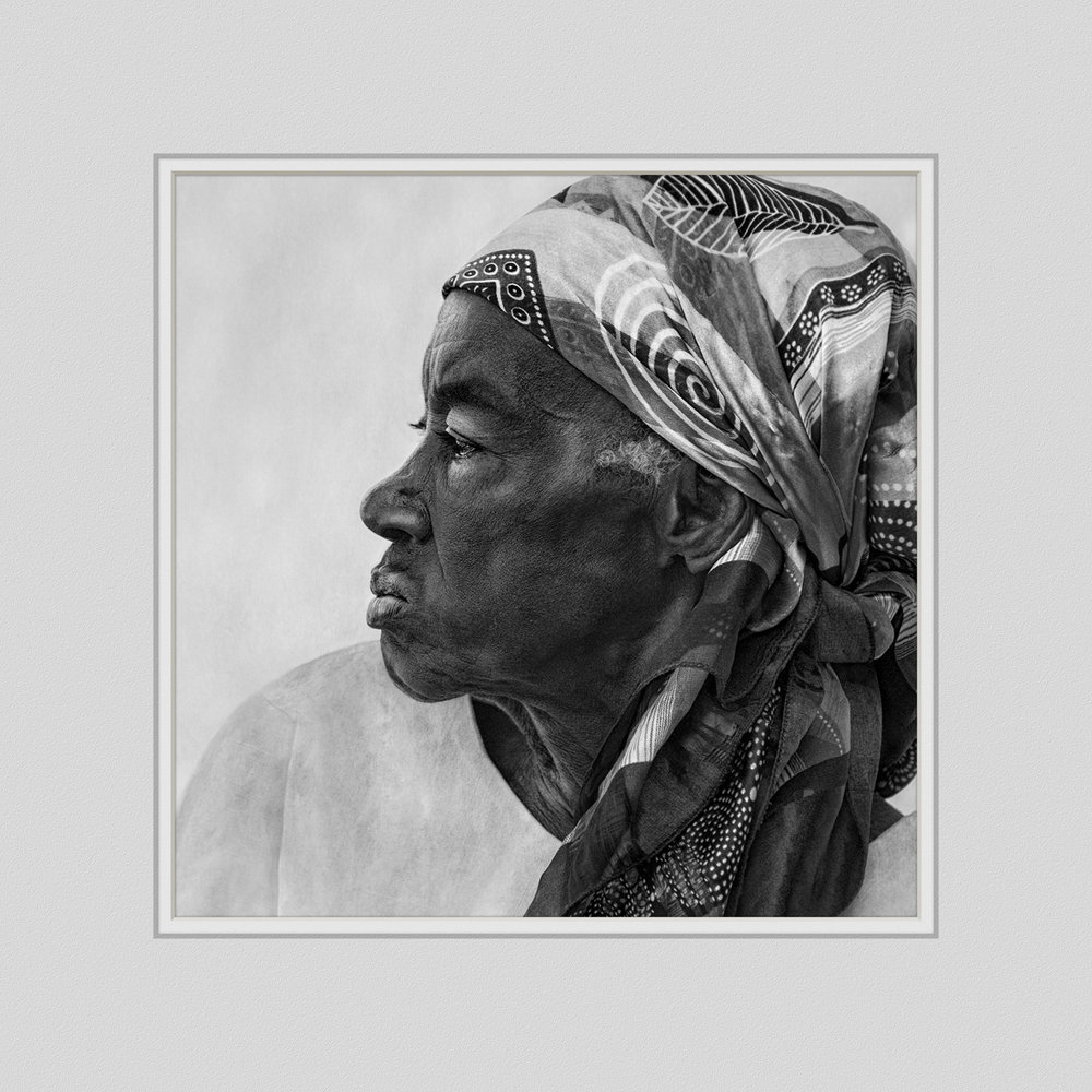
In our small-group, intensive fine art print workshops, I get asked a lot about framing options. My associate and I are believers in traditional framing, both for its elegance and for the fact that it enhances and does not compete with the image itself. We prefer our traditional prints to be set in matte black frames with white double- or triple-mats (such as Rising Museum Boards). Art collectors and our most discerning clients typically choose this option.

Enter Canvas Prints

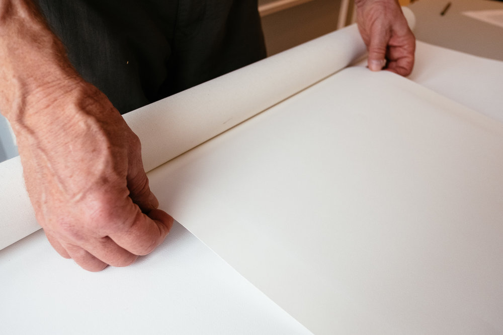
But, what about canvas prints? This print option has become highly popular, both for its cost benefit for consumers as well as its wide range of display options. Of course, there is always the standard canvas display option of wrapping the print over wood braces and hanging it as a clean, simple work of art, and we do occasionally sell canvas images with that treatment. However, a few years ago we began offering our clients a framed canvas option which is generally known as a "floating frame" or "open frame".

There are many variations on the floating frame theme, but I’d like to offer those of you new to the game an idea of how to construct floating frames yourself easily and inexpensively. Once you get the hang of it, you’ll find yourself developing spinoffs unique to your photography. In fact, we now offer several floating frame options, including one for traditional fine art paper prints.  Their less formal presentation is appealing to some clients.

Open frames refer to the fact that the image is not enclosed in glass or Plexiglas. Open frames also typically include a "gutter" between the canvas (or print) and the frame edge. When we first offered this open frame option, we were charged around $300 and up for a 30" x 40" frame. Now we make our own open frames in-shop for under $75, not including labor. However, once you get some experience, it should not take more than an hour or two to create a floating frame. The rest of this article is a how-to, illustrating how we create these open frames.

Stick It To Me

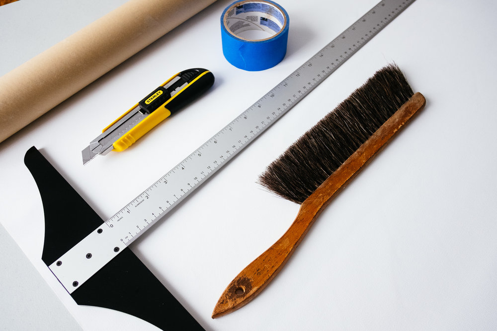
The key to holding down expenses is to order the framing pieces in bulk. These frame "sticks" are available from a variety of vendors and in different lengths. A careful Internet search will show you vendors near you so that you can save even more on shipping charges.

We generally buy three stick sizes corresponding to the thickness of the canvas wraps, namely .75, 1.25 and 1.75 inches. Smaller canvases would get the .75" open frames, while larger pieces get the 1.75" frames. I typically order several hundred feet at a time of mixed sizes in ten-foot lengths.

Floating frame sticks are different from standard framing sticks that you would use for prints behind glass. They do not have an inner lip to hold the glass (see ILLUSTRATION #1). They are also typically free of adornments on the frame edge facing the viewer.
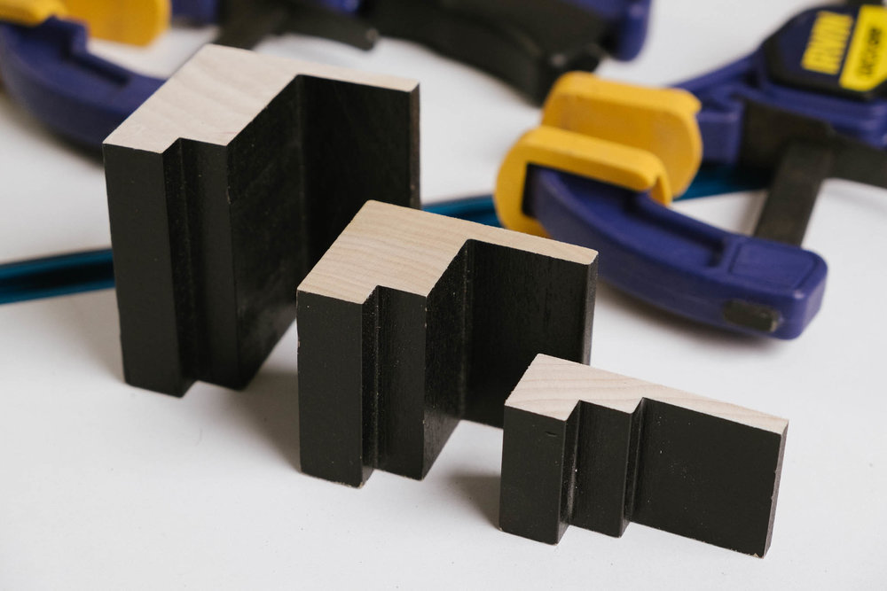
Illustration #1

Also, floating frame sticks do not have a completely open back, like traditional framing sticks. Instead they include a wide "platform" that is needed for the back of the canvas frame to rest against and adhere to, whether with glue or screws.

Measure Twice… Cut Once 

The old carpenter’s maxim - measure twice and cut once - applies here. I’ll assume that you have already wrapped your canvas over a suitable frame. Depending on the thickness of the frame (.75”, 1.25" or 1.75"), assemble the appropriate thickness framing sticks. If the sticks are not painted, now is the time to do that.

I prefer to use a primer spray as a first coat, and then spray on two light coats of flat black paint. With the proper setup, this process should take 10-15 minutes for each coat for a frame that is 30" x 40". Depending on the specific brand, most paints need several hours between coats, so I sandwich the job between other chores. Be sure to wear gloves, eye protection and a breathing mask.

Once your sticks are completely dry (allow 24 hours), carefully measure the length and width of your wrapped canvas, not the dimensions of the original wood frame that the canvas is wrapped around. That is so that you incorporate that little bit extra material that is required due to the thickness of the canvas wrap itself. You want to ensure a snug fit.

For simplicity purposes, let’s assume that you have a 24" x 36" finished piece, canvas wrap included (you should first coat the canvas with a protectant). This means you will need two sticks at 24" length and two at 36" - to the **inside** dimension (see ILLUSTRATION #2). You will need to cut the pieces to allow for the 45-degree miter corner cuts to extend out from your measurements. Please note that the open frame sticks have three levels to them. The wrapped canvas will rest on the flat backing platform. So you want the inside dimensions to be measured at the second step, as indicated by the arrow in illustration #2.
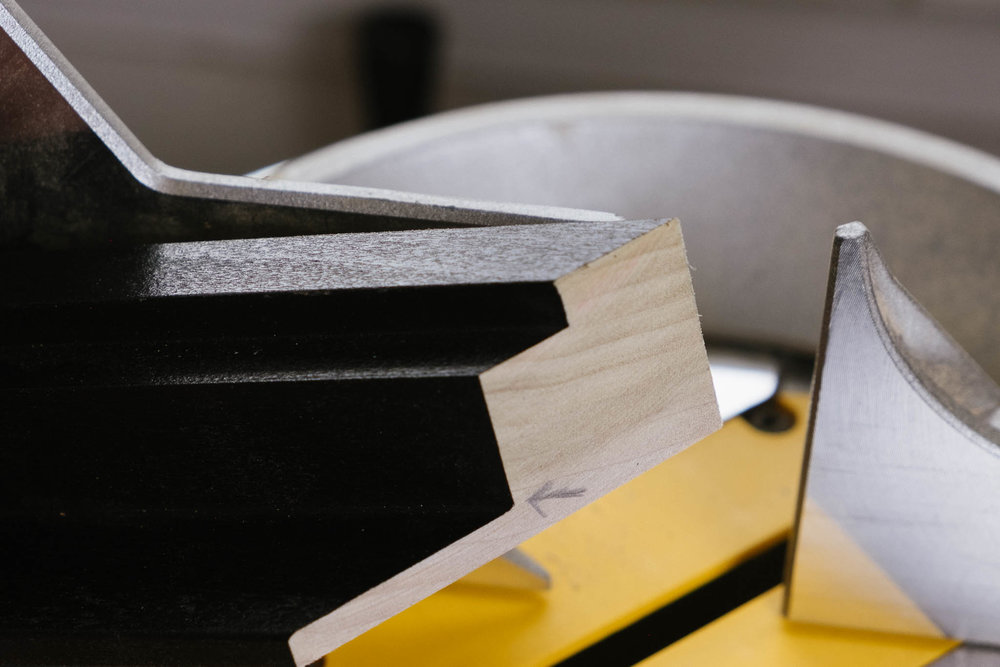
 Illustration #2

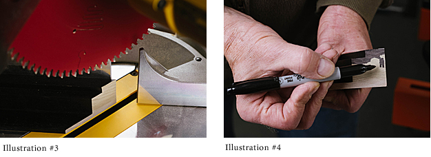
Using an electric or hand miter saw, carefully cut the first miter at 45 degrees, making sure that the sticks are oriented properly (see ILLUSTRATION #3). Once that is done, remeasure the stick to get an exact measurement to the **inside** of the miter on the opposite end of the stick so that it equals precisely 24" or 36". This ensures that your mitered corners will be exact.  If you are using an electric miter saw, I recommend using an 80-tooth blade for clean cuts. With a hand miter saw, use one with as fine teeth as possible. Sand lightly as needed. With all the miters done, you are ready to begin assembly.

Assembling the Frame

Before you start permanently assembling the frame, first take some of that black paint (or whatever color you painted the sticks) and dab some about 1/4 inch in along each mitered corner (see ILLUSTRATION #4). This will prevent any unpainted edges from showing if your frame is a bit off a perfect 45-degree angle. You can even use a black permanent marker, as shown here, but in that case use two coats.

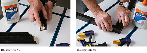
Once the frame is completely dry, spread a thin layer of wood glue on each mitered corner and fit the pieces together loosely to ensure that the fit is good (see ILLUSTRATIONS # 5 and 6). Wipe off any excess immediately.

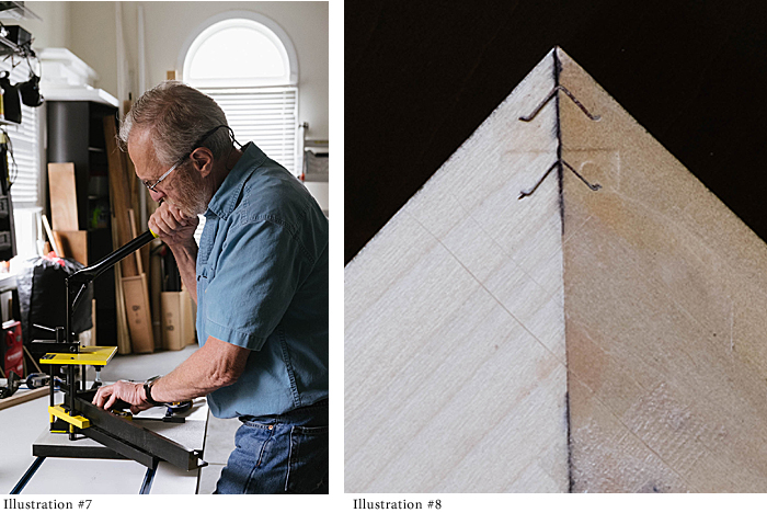
There are alternate ways to actually fasten the pieces together permanently. Our preferred method is to use a simple hand-operated machine available from many suppliers. This machine holds two corners tightly together to create a perfect joint. While they are being held in place by the machine, you pull down on a handle, which forces a corrugated metal wedge into the back side of the frame (see ILLUSTRATION #7 and 8). That wedge keeps the corners tight. When the glue dries you will have a joint that is more permanent than the wood itself.

There are times when we use glue and a nail gun to permanently adhere the corners, especially with smaller pieces. In any case, pick a method you like and stick with it until you become thoroughly familiar with it.

Other Uses For Floating Frames

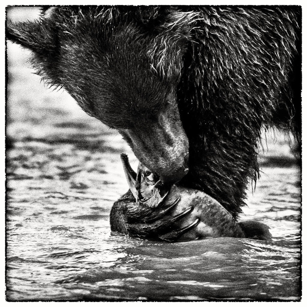
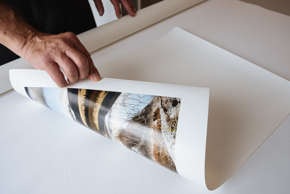
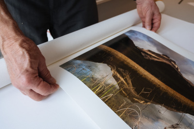
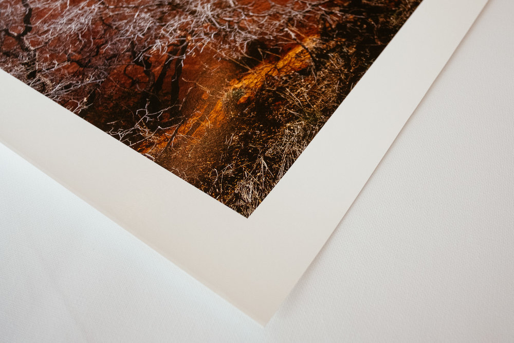
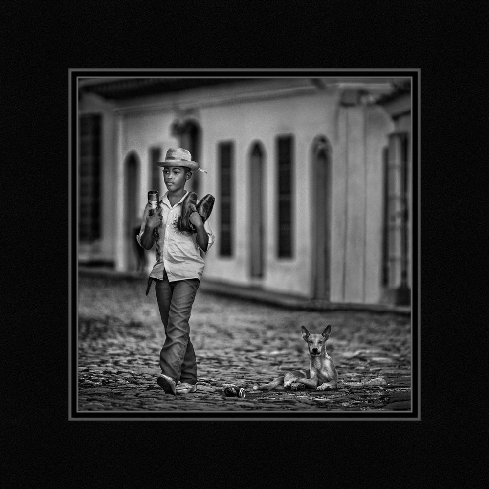
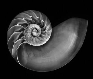
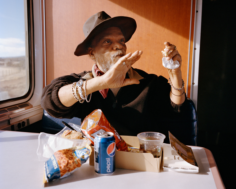
Illustration Elephant 1Floating frames can also be used with traditional fine art paper. This open-faced display is increasingly popular (see ILLUSTRATION-ELEPHANT-1). In this case the print is first mounted on rigid Gatorboard and the entire board mounted on the frame with glue. One word of caution: make sure to first double spray the print with Moab Desert Varnish or equivalent, since the print is exposed directly to air and fingerprints (see ILLUSTRATION #9).  That double coating also gives some degree of UV protection. We love this presentation with a textured paper, such as the Moab Moenkopi line.
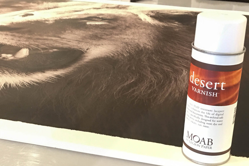
Illustration #9

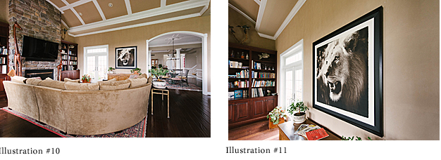
We have also developed an enlarged version of the open frame for areas where a super-large print is desired. We simply enlarge the border by using flat black mat board, as in the image of the Kalahari lion I photographed in South Africa (ILLUSTRATION # 10 and 11).

Finesse and Display

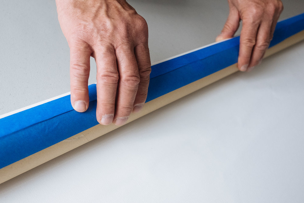
We like to finesse the final product by covering the back of the frame with a thick brown paper. We cut the paper 1/8" short on each side and then glue it to the frame. That gives the back a clean, professional look (see ILLUSTRATION #12) and protects against dust and insect damage. 

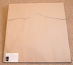
Once the entire presentation dries, you can insert metal eye hooks and wire to the frame for hanging (see ILLUSTRATION #12). I prefer to pre-drill the holes for the hooks to prevent splitting.

Our clients love the open frame display option, particularly young people just beginning to invest in fine art photographic prints. 

Why not give this display option a try? I think you’ll be pleased with the results, as will those viewing your artwork.


About the Author

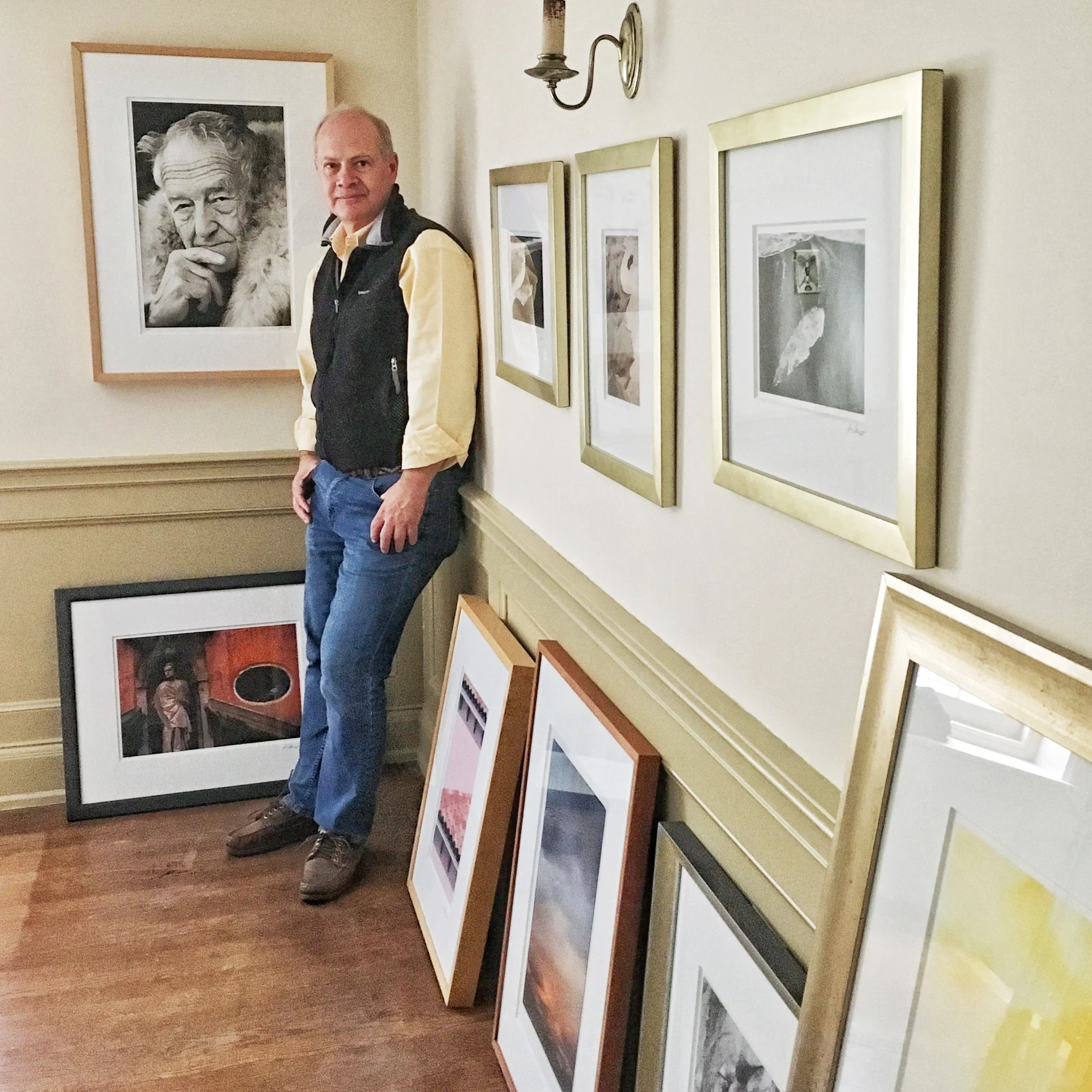
Les Picker is a professional photographer with credits in National Geographic publications and dozens of others. He is a Moab Master and was awarded the prestigious Canada Northern Lights Award for Best Travel Photography. Les offers photo tours throughout the world. His fine art print workshops are sponsored by Moab 

Paper Curl and (those dreaded) Print Head Strikes

Written by Les Picker
Photography by Robert Boyer
 

Fine art printing today is far easier than even a decade ago. Still, newbies have a slew of things to think about as they climb the learning curve and gain experience. Color management, paper selection, printer dialogues, you name it and it's another item on the way to fine art printing mastery.

But how many of us think about the importance of flat paper? What does one do when fine art cut-sheet paper curls? Here I'm talking about curls that happen in boxes of sheet paper, not the curling that happens at the end of a roll of fine art roll paper (that's a separate discussion… stay tuned). This may sound like a trivial matter if you are new to printing, but when your print heads start striking those curled sheet edges, you'll be seeing dollar signs - big ones - popping up.

As a Moab Master, I thought I'd do a quick scan of some of my fellow Moab Masters to see how they handle keeping cut sheet paper flat. I also wanted to hear from the folks at Moab on how they take paper curl into consideration at the paper design and manufacturing stages.

Some Background

“What some people may not realize is that all paper is initially produced on a roll,” explains Marc Schotland, VP, Marketing for Legion Paper. “The curl is caused by the natural formation of the fibers pressed against the core of the roll.”

Once these jumbo rolls are produced, they are sent off to be coated. When the paper is coated, an anti-curl back-coat is applied to counteract the coated/printed side. These now-coated jumbo rolls are then sent off to be converted into sheets and mini-rolls (those 17”, 24” 44”, etc…).

“Obviously, the paper closest to the core will exhibit the most persistent curl memory,” Schotland continues. “But those sheets from the roll flatten over time as they are laid out on a flat surface so that the fibers will 'relax’ and modify their formation to match the flat surface”.

The problem arises when paper is kept unsealed in extreme humid conditions or fluctuating temperatures. The fibers will change formation again, sometimes even buckling if enough moisture gets into the paper.

Notes From the Real World

As a working pro myself, our studio sometimes experiences cut-sheet paper curl. We tend to go through our paper stock fairly quickly, between prints for clients and our fine art printing workshops, which minimizes the chance of curl.

Although we try to follow preventive measures to reduce curl, we're not always perfect. My assistant or I will leave a box opened overnight, or we will take out 10 sheets, only print five and then find the rest, slightly curled, two weeks later!

"In my experience, curl seems to happen with glossy and luster papers more than matte finished papers," says Jim Graham (www.jimgrahamphotography.com), a Moab Master and well-known East coast master photographer. I would agree with Jim. I have yet to have an issue with curl in matte papers even though they, too, are coated. But whatever the paper type, sheet curl can be frustrating, especially when you are under pressure to get a print done."

An Ounce of Prevention…

Based on this foray into paper curling in the box, here are some suggestions from my fellow Moab Masters, and from Moab itself, for how to keep paper flat.

“Always store paper horizontally, not vertically,” suggests Evan Parker, Moab Support Specialist.

Keep paper in the original plastic bag, in the original box. In our studio we also tape the plastic bag to seal it from the elements when not in use.

If you cannot remove the curl, use the platen gap settings on your printer to widen the gap between print heads and paper.

“Store your paper in a humidity-stable environment, out of direct sunlight, and away from heat or a/c registers,” Parker also suggests.

On some of our larger cut sheet papers, 13“x 19” and above, I also add a handy desiccator tin to the box or bag that the paper is stored in (available online). When the desiccator captures all the humidity it can, just pop it in a 300-degree oven for 3 hours (a toaster oven works great!).

… And a Pound of Cure

Even the best preventive program sometimes fails. What do the pros do when that happens?

“If it's just minor curl, I simply will invert the paper in the box and let its own weight flatten it,” Jim Graham tells us. “If it's a major curling issue I'll sandwich the paper, wrapped in archival paper, between books. And let the pressure of the books and their weight flatten out the curl.”

Moab's Evan Parker suggests we let the sheet sit out in our printing environment for 30–60 minutes to see if an environmental adjustment resolves the curl.

In our studio we'll try gently reversing the curl with cotton-gloved hands, so as to prevent oils from our hands from contaminating the paper. On occasion I use a tissue-paper covered empty paper tube to get the job done. Gentle is the operative word here.

“I load each sheet individually into the printer with the flattest edge going down into the printer first,” explains Harold Davis (www.digitalfieldguide.com), a Moab Master from the West coast. “If the printhead seems to be striking one of the side edges of the paper, I'm not beyond opening up the printer door, which stops the printhead in its tracks, and gently smoothing the paper down. Then I'll close the print door, and printing will resume automatically.”

Still, no matter the printing challenge, we all know the value, and classic beauty, of the printed image. Moab Master Harold Davis summed it up best: “Sure, paper curl is a fact of life. But there's nothing like making hand-crafted, artisanal prints for satisfaction with one's work. Even though it is a digital world, you still make prints one-by-one, with one-off attention to sheet curl and many other issues.”

Les Picker is a Moab Master from Maryland. You can follow Les' blogs from his website: www.lesterpickerphoto.com

Achieving Your Potential As A Photographer

This workshop is for every photographer who wants to draw their line in the sand to become the best photographer and artist they can be. Using the exercises he developed for his highly-acclaimed Achieving Your Potential As a Photographer: A Photographer’s Creative Companion and Workbook, Harold Davis will work in a supportive group environment with each participant to help them discover their unique photographic potential.

The workshop will include group and individual exercises and assignments. There will be guided field sessions, and work in the classroom. Technical and practical skills and topics will be covered.

Each participant will come away from the workshop with real-world skills, an enhanced sense of their own creative strengths, and a detailed roadmap for how to best achieve their own creative potential. Besides learning a new way to view their own work, and the ability to benchmark goals for future progress, participants can expect to create a personalized workbook that will continue to help them reach these goals long after the workshop has ended.

This is a workshop intended for participants of all levels. It’s never too late to hone your skills, and to unleash the powerful and positive creative forces that are waiting to be discovered within each of us.

Register here.

Glazer's Photofest 2016


Glazer's Photofest hours are Sat. June 11th from 10am-6pm and Sun. June 12th from 11am-5pm. 

Visit the Moab Paper booth for paper advice, questions and to get your free print! 

All workshops and photowalks are free on a first come first serve basis and pre-registration is not required.

"At Glazer’s we believe that photography is more inspiring when shared. It’s more than just posting an image to social media, sharing means stepping out from behind our viewfinders and computer screens to truly engage with others that share our passions. Every day we have the opportunity to work with our customers, vendors and friends. We have the privilege of meeting the interesting personalities, hearing each unique story, and of course seeing the stunning work you all create. But too rarely in today’s world do each of you have the same opportunity to come together as a community.

Now in its 7th year, Photofest continues to exceed our wildest expectations. It has become so much more than great deals and sneak peeks. Now the free classes, workshops, photowalks and demonstrations we organize have a larger purpose. It gives us all—professionals, enthusiasts and weekend warriors alike—a chance reconnect not only to our work, but to each other.

A photograph captures a moment that is fleeting, but the relationships we build along the way endure. Thank you for being a part of it."

In Search of Great Men

A train journey in 2011 from his hometown in North Carolina to Virginia, inspired fine art photographer McNair Evans to explore contemporary America through the country's passenger rail system. For over three years, Evans has embarked on biannual two-week long Amtrak trips, what the artist calls a "public artist residency," using the time to meet and converse with fellow passengers, record their stories and photograph the people and the landscape.

Presented for the very first time by the San Francisco Arts Commission Galleries, Evans' epic project, In Search of Great Men, combines compelling original photography and first-person, passenger-written journals that capture the unique cross-section of train travelers, offering the viewer a poignant and empathetic view of their lives. The images are printed on Juniper Baryta Rag 305.

View exhibition details.

How did you choose Juniper for your gallery?

For years I had worked with the Moab Colorado Fiber Satin, which is an excellent paper. Legion Paper’s printing expert Evan Parker and I had been discussing the papers performance and suggested that given the warm, moody quality of my photographs, that I might like Juniper.

How did the Juniper paper portray your artwork/ personal style?

Juniper produces a rich black point while holding detail in the shadows much like a traditional C-print. This, along with the papers warmer stock, help me produce images with depth and rich colors in the darker print tones.

Who did the printing for the exhibition? Which printer did they use?

I do all my all own printing, and always have. Many people think that Inkjet printing, because it is computerized, is automatic. This couldn’t be further from the truth. With the introduction of such control comes the responsibility of precision of vision. Because of the sheer volume of the show, San Francisco’s Rayko Photo Center dedicated a brand new Epson 7890 and studio space to my printing. I’m generally most productive in the evenings and night time, so would print until about 3 Am, and then literally sleep beneath the Epson.

Any advice for other exhibitors choosing a paper for their gallery?

When choosing an exhibition quality paper, it’s helpful to consider the visual characteristics of your imagery. Do most of your picture occupy the highlights? Are there regularly large areas of shadows? Does your vision run cool, or are there more warmer tones. Understanding the pallet of your project or work will help you pick a paper the performs well in those specific areas.