Moab Paper
Subtotal: $0.00 Cart
  • juniper baryta rag


    our best reviewed and most award-winning paper yet


  • the source of our inspiration


    premium, archival fine art inkjet papers wrapped in the intimacy of a rural culture

    @Jenniferking_photographer
  • Free MOAB classes


    videos and livestreams released weekly

  • juniper baryta rag


    our best reviewed and most award-winning paper yet


  • the source of our inspiration


    premium, archival fine art inkjet papers wrapped in the intimacy of a rural culture

    @Jenniferking_photographer

Harold Davis Tests Entrada Rag Textured, Here's What He Thinks...

©Harold Davis. All rights reserved.

Entrada Rag is the superb, acid-free paper that put the Moab Paper brand on the map some fifteen years ago. So as a Moab Master I was honored to be asked to evaluate and test Moab Entrada Rag Textured, the first addition ever to the Entrada Rag line, during the pre-production stage for the paper. It’s great news for photographers and artists that Moab Entrada Rag Textured is now generally available.

Like the original Entrada Rag Bright and Entrada Rag Natural papers, Entrada Rag Textured is of course acid-free. Also like Entrada Rag Natural, it is a 100% cotton paper that is somewhat warm-toned. This is a very thick sheet (300gsm) with a great sense of “hand” that is entirely OBA free, and (like the original Entrada Rag Natural) boasts an extraordinary tonal and dynamic range for a matte paper. Note that Entrada Rag Textured is single-sided, as opposed to Entrada Rag Bright and Natural, which come both in single-sided or double-sided versions. The tonality of Entrada Rag Textured is much like the creamy feeling of Entrada Rag Natural, rather than the very bright white of Entrada Rag Bright.

Entrada Rag Textured has become one of my favorite go-to printmaking substrates. © Harold Davis

Entrada Rag Textured has become one of my favorite go-to printmaking substrates. © Harold Davis

As you might expect, the primary difference between Entrada Rag Textured and the original Entrada Rag Natural is, of course, the texture of the surface. But what you have here is an elegant, refined texture---not an over-the-top "watercolor" paper.

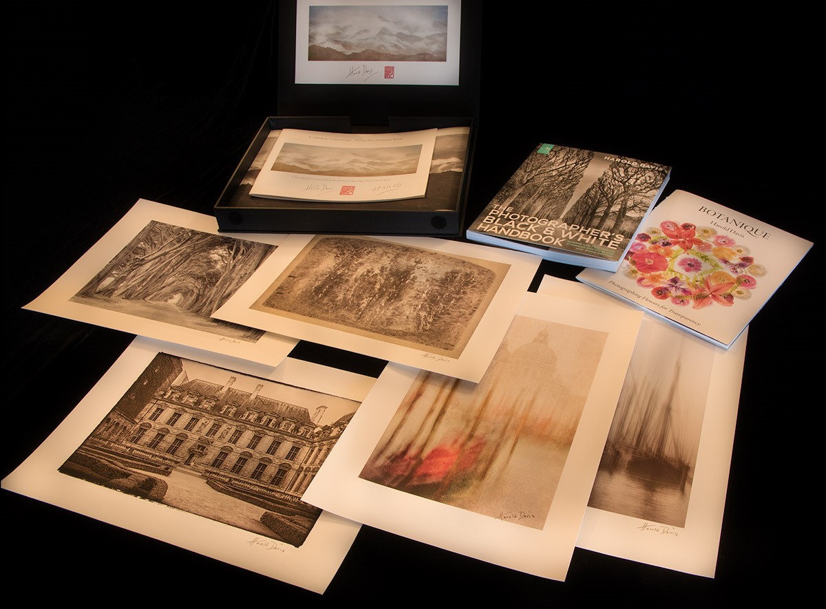
(Above) This image is a long exposure made from a moving Venetian vaporetti. In post-production I lightly texturized it. The blend of the texture and the Entrada Rag Texture helps create a unique and subtle effect. © Harold Davis

(Above) This image is a long exposure made from a moving Venetian vaporetti. In post-production I lightly texturized it. The blend of the texture and the Entrada Rag Texture helps create a unique and subtle effect. © Harold Davis

Just as the warm-toning of the Entrada Rag Natural paper is subtle, the texture that Entrada Rag Textured presents is also subtle. Photographs printed on Entrada Rag Textured will look like art, and the finished print will be a delight to handle as well as to look at. In other words, Entrada Rag Textured charts a middle "Goldilocks" course: textured, but not too textured. It is a paper that is indeed "just right", and makes the image look great, not a paper that is so "too-too" that the presentation becomes about the paper rather than the photo.

Of course, like any high-end specialty paper designed for modern photographic printing, Entrada Rag Textured is not one size fits all. It works better with some kinds of images than others. To get a sense of the kinds of images that really "marry" well with Entrada Rag Textured, and to learn what this paper does best, we made numerous test prints in my studio using my large format printer.

One thing I found is that this is a paper that really works well as part of the print presentation. In other words, I would never print right up to the bleed-line (edge) with Entrada Rag Textured. It makes much more visual sense to allow the paper to show around your image---and to strongly consider the imposition and spacing of the print on the paper as an integral part of printing-making with Entrada Rag Textured. Showing an inch or two (and sometimes more!) of Entrada Rag Textured around the borders of any image enhances the art print and gallery effect of this paper.

To emphasize the antique look in this print I added a border before printing it on Entrada Rag Textured. © Harold Davis

To emphasize the antique look in this print I added a border before printing it on Entrada Rag Textured. © Harold Davis

The combination of a moderate warm tone, refined texture, and high dynamic range is a pretty spectacular set of characteristics for any paper, and helps to make Entrada Rag Textured a winner that is appropriate for a wide range of images. Of course, it is not, never will be, and should not be used like you would use a more glossy photo paper (glossy papers with a more "photographic" finish of course have a great place of their own in the world). So in my experience, the images that work best with Entrada Rag Textured are artful, and intended as art (as opposed to, for example, journalistic-style imagery).

With monochromatic imagery, I would strongly consider toned or somewhat old-fashioned photos (as opposed to "straight" black and white) for Entrada Rag Textured.

The subtle mid-tones of this photo of a row of cypresses is a great match for the ability Entrada Rag Textured has to render subtle tonal gradations. © Harold Davis

The subtle mid-tones of this photo of a row of cypresses is a great match for the ability Entrada Rag Textured has to render subtle tonal gradations. © Harold Davis

With color imagery, I get great results essentially across the gamut of landscape photography, particularly in imagery where the real strength is in separation of mid-tones. My personal preference on Entrada Rag Textured is for color imagery that has elements that echo antiquity, and so lie in the cross-roads between modernism and older traditions of printmaking and art.

There’s no doubt in my mind that Entrada Textured Rag has become one of my "go-to" printmaking substrates. Combining high quality reproduction with a sensitive and sensuous surface that is entirely fiber, I expect to be making prints with Entrada Rag Textured for a long time to come.


(Left) The rendering of the structure underneath the Art Deco Yaquina Bay Bridge in Oregon is a good fit for Entrada Rag Textured: the paper shows and holds details, even in the areas that are almost black. The paper handles ink well and doesn’t overload, even in very dark areas. © Harold Davis

Ghosts of the Arctic, A Short Film by Joshua Holko

The product of more than years of planning, Ghosts of the Arctic was film exclusively in the Arctic archipelago of Svalbard in the depths of winter. It is my hope that the film will impart some of the haunting beauty of this incredibly precious and endangered polar wilderness; as well as give you some insight into my life as a Polar photographer. I hope you will take six minutes out of your day; set your display to full screen, turn off the lights, crank up the volume and allow Ghosts of the Arctic to transport you away to one of the world’s most spectacular polar regions in its rarely seen winter veil.
— Joshua Holko

For more behind the scenes information about the filming of Ghosts of the Arctic please visit Joshua Holko's blog.

Share

Is There a Portfolio in Your Future?

We recently completed a 3-day workshop for advanced amateur and professional photographers to help them create their first professional quality fine art portfolios. My hat is off to Norm Arnold, Jim Harris, Lew Rothman and Jeff Wagoner, who spent an intense few days focused on culling, critiquing, post-processing (again and again), printing, sorting, sequencing and finally assembling their art into a coherent and beautiful narrative.

By no means was this a laid back weekend. We started on Friday afternoon and finished on Sunday afternoon. But there was lots more to it than the face time we spent together. For two months prior to the workshop, these brave photographers submitted 50-70 images to us that they were considering for their portfolio. My assistant Bob and I offered our critique and suggestions and set a firm benchmark.They were to show up to the workshop with no more than 30 images!

As if that wasn’t agony enough, the goal at the workshop was to further cull their images to the 10-12 very best ones that would be printed at 13” x 19” for their portfolio. Whew!

As my very capable assistant, Bob Boyer, likes to emphasize, the production of the actual portfolio is really only a by-product of our Portfolio Development workshop. The real goal was to teach these talented photographers how to critically edit themselves, and how to reach out to others for editorial feedback. Self-editing is perhaps the most difficult part of assembling one’s representative work. I know that from my own experience and have heard that from colleagues and clients hundreds of times over the decades. Editing ourselves is something we must do constantly, whether for a portfolio, an exhibit, for our smart phone displays, or just for selecting our best images for showcasing on our desktops. Trouble is, most photographers do not do a good job of self-editing, so the primary goal of our Portfolio Development workshop is to teach those critical skills.

The Rubber Meets the Road

When it came time to actually print the final selections of images for these talented folks, we turned to our trusty pair of Canon Image Prograf 1000 printers. Believe it or not, we churned out 160 prints within 24 hours without a glitch. These workhorse printers are a real dream.

Still, where the rubber meets the road in fine art printing lies in the paper choices one makes, and in our experience nothing beats Moab fine art paper. Yes, Moab is one of our sponsors, but anyone who knows me understands that after five decades in photography I am not beholden to anyone. Bob and I chose Moab carefully after years of experimenting with every major (and some minor) manufacturers’ papers. Not that there aren’t some other fine brands out there - Canson and Hahnemuhle immediately come to mind - but Moab’s line is fine-tuned to the needs of fine art photographers.

Moab actively seeks feedback as they develop new papers. The perfect example of that is their newly released Entrada Textured Rag, which Bob and I are gaga over. Moab asked us, and several other of their Moab Masters, to beta test it last year. Frankly, some papers don’t make the grade and we credit Moab with abandoning those papers even after significant investment of time and money. But Entrada Textured Rag is definitely a winner. I’ll blog more on it soon.

Anyway, our portfolio clients chose to print on Moab’s Entrada Rag Bright, a matte paper, and on Moab’s Juniper Baryta, a semi-gloss. In all cases we chose the heavier weight options for the papers so they would stand up to frequent handling, since the intent of any portfolio is to showcase a photographer’s work to a wide audience.

So Why a Portfolio?

As I said above, a portfolio is a great way to showcase your work to potential clients, family, friends and fellow photographers. But it serves several other purposes that may not be quite so obvious, but just as important.

Portfolios are a wonderful way to group images together. For example, many photographers today create books and ebooks of their travels. In the same vein enterprising photographers create portfolios of fine art prints of those same travels. Some photographers will have those portfolios lined up in their bookcases, ready to exhibit when needed.

Portfolios are a Zen experience as much for your audience as they are for yourself. People who look at smartphone images swipe through them at blazing speed, rarely spending more than a few seconds on each. But hand a person a fine art print and you’ll see them examining it for details, admiring the way the scene is rendered, and even enjoying the tactile sensation of the luscious papers. There is nothing quite like handling a fine art print, one that WOWS! your audience.

But, perhaps the major reason for committing to doing a portfolio is the self-discipline it teaches you about editing, post-processing and finally, printing. When real estate is precious, one tends to take a great amount of time and great care in the selection process. A decent portfolio does not seek to drown the viewer in images. Instead, that critical self-discipline results in a highly select group of perhaps 10-15 of the best images the photographer can put together at that time. It is not a quantity contest, but rather a quality presentation that says to the world, this is who I am as a photographer at this moment. And the beauty of the portfolio is that prints can be swapped out at any time as taste and experience dictate.

From our perspective the Fine Art Portfolio Development was a huge success. But we’ll let one of our clients sum it up for us in an email we received after the event.

The Toughest Print

by Joshua Holko

As many of my regular readers, friends and fellow photographers know, I love to print. For me, the photographic print is not only the final end result of the photographic process, but is importantly the ultimate expression of my work. The online jpeg is nothing more than a poor facsimile of the finished fine art print; where as the finished print is the medium in which I prefer to have my photography viewed. I really wish I could more easily share my printed photographs with a broader audience(Facebook needs a print sharing service!) and whilst it is possible to visit one of the galleries that represent my photography it is not always convenient or possible; especially for those that are not local.

I have in the past written about my need to print and spoken to the fact that I never really feel like I have finished with a photograph until I have made a print. The journey and process is extremely satisfying to me and the print is the final finish line for each photograph. Honestly, not every image makes it over the line, but those that do give me a great deal of satisfaction.

Over the last few days I have been working on a particular print that has proven to be the most difficult of my career thus far and I want to share how I finally achieved the perfect print of this photograph. It’s not a photograph that translates well in an online jpeg (unfortunately the jpeg compression destroys the tonalities), but it is simply wonderful in its final finished printed form. The photograph was taken last winter in Svalbard during my snow mobile expedition and is a layered white-on-white arctic landscape. The landscape was bathed in a very soft ethereal light when I made this photograph and contrast was extremely low. Super dense cold air hung low in the valleys and a subtle gentle fog softened the distant mountains. The darkest part of the scene was a distant rocky ridge-line, but even it was many shades above black.  As a result the scene was high-key, yet it contained no harsh whites or blown out areas. Honestly, outside of getting to this remote location and the freezing temperature (around -30º Celsius) it was not a difficult photograph to make. It has however been a complete bear to process and print.  There are literally hundreds of shades of different white in the photograph with extremely delicate tonalities that require just the right amount of finesse to print. Anything less than perfect results in flat areas that lack depth.

The heart of the problem is that inkjet printers are not equipped with white ink. So, the whitest white one can achieve in an inkjet print is the natural white of the paper you have chosen (and not all papers are created equal). Hence, paper choice is a critical factor in the fine art printing process.  Whilst it is true that lustre and gloss papers have a better d-max (better, deeper blacks) than matt papers I vastly prefer matt papers for their art feel, surface texture and softer finish. I personally find lustre and gloss papers (even the expensive Baryta papers) take away from the evocative feelings I want to portray in my work. As a result virtually all of my printing is on matt paper – specifically Moab Somerset Museum Rag.  Somerset Museum Rag is a 300 gsm fine art paper with a subtle surface texture and a wonderfully high white point (with a good solid black point for an art paper). I have been printing with Museum Rag for many years and I have a very good understanding of the capabilities and limitations of this paper. It is absolutely ideal for printing snow and ice images in my experience.

Before I describe the process by which I achieved what I feel is the perfect print of this photograph I want take a few steps backward and start at the beginning of the process. The real key to making a fine art print is to start with a great capture. Anything less than a great capture will never be a great print – period. By a great capture, I mean an image that has been well exposed with its histogram biased towards the right hand side (without clipped highlights) , sharp where it needs to be and free from excessive noise. Once you have a great capture you need to carefully process the RAW file to bring out the best in the photograph (a totally seperate skill to the capture process). In the case of this photograph I took extreme care with contrast and highlights to gently pull out all of the subtle tonalities in the highlights in the file. There would be a strong temptation amongst many to bring down the blacks in this file until the rocky ridge-line had a hard deep solid black; but thats not how the scene was in reality and such artificial contrast would look extremely unnatural. As subjects get further away from our eyes they naturally loose contrast and bleed off into the distance. Artificially adding too much contrast will add impact, but it does so at the expense of image depth so you have to tread very carefully. This is of course an artistic decision, but in my case I wanted to print the scene as I remembered it and not create something that did not exist in Nature. All up, I probably spent an hour or so processing and re-processing this file until I was happy with the end result. Only then can you consider making a fine art print of the photograph.

At this point the first thing you need (other than an actual printer) is the best profile for your printer, paper and ink that you can lay your hands on. On no account should you compromise on the quality of the profile and on no account should you even consider using a canned generic profile. You absolutely must have a custom made high quality profile that you either made yourself, or had someone (who knows intimately what they are doing) make for you. I make own own profiles with an X-Rite ISIS2 and with a friend using his Barbieri Spectrophotometer. There are key differences between these units so I use both depending on what paper I am profiling.

Assuming you have ticked all the above boxes how do you then print a photograph that is basically a thousand shades of white on a piece of white paper with a printer that doesn’t use white ink?

The answer is you have to understand what the white point of your chosen paper is and what is the brightest white you can print on that particular paper. Without this information you have little chance of actually rendering all those subtle white tonalities and shades in the print. In my case, I started by actually measuring the white point (and black point) of Somerset Museum Rag which turned out to be 90.3 with a Dmax of 3.2. I then used this information to modify my custom profile to ensue my whites would not be blown out during printing.

I then created a test chart as below that has shades of white and black from 0 (black) to 255 (pure white). I then printed this test chart with my custom modified profile for Somerset Museum Rag, allowed it to dry and then critically examined it in my Graphiclite print booth to see how much highlight and shadow gradation I was actually achieving. In my case (and with my eyes) I can see highlight detail in my test print all the way up to 253 and shadow detail all the way down 5. Anything below 5 is the same shade of black to my eyes as the 5 shade. In the highlights anything above 253 (254 and 255) appear as paper white to me. This is an exceptional result on a matt paper and is testament to the quality of the profile used to make the print.

Armed with this information I now knew that anything in my file that was above 253 would render purely as paper white and anything below 5 would render as a solid black. In this photograph the blacks are actually all but irrelevant since the darkest shades in the photograph are well above this (but it is an interesting exercise to understand for prints with dark tonalities). I then soft-proofed the image in photoshop with my custom profile and the Relative Colorimetric rendering intent and used a levels adjustment to tweak the highlights. In essence I manipulated the brightest tones in the photograph to bring them down to a point where I could see tonal gradation on the paper. I then used several curve layers to increase highlight contrast in certain tones to compensate for the fact that the front lit paper has a lot less contrast than the back-lit LCD screen. Great care had to be taken with these curves to ensure I kept my highlights under the paper white level. I then made a number of test prints of the photograph making small subtle adjustments to the curve layers to better render the tonalities in the extreme highlights. This was an iterative process that took quite a few prints to get just right.

The end result is to my eyes absolutely perfect in terms of its rendition of tone in the highlights. The soft ethereal mountains are perfectly rendered with all of the mystical feeling I remember when I took the photograph. The rocky ridge-line and gentle snow slopes blend their shades of white perfectly; with the foreground having just the right amount of texture and tone. Although I would never enter this print into a competition (most judges would fail to grasp the difficulty of the print) it was one of the most rewarding I have made in recent times.

If you are not printing your work I urge you to make a start and get those 1’s and 0’s off your hard drive and onto paper where they can fully be appreciated. It is absolutely one of the greatest joys of photography.

Visit Joshua Holko's website here.

Share