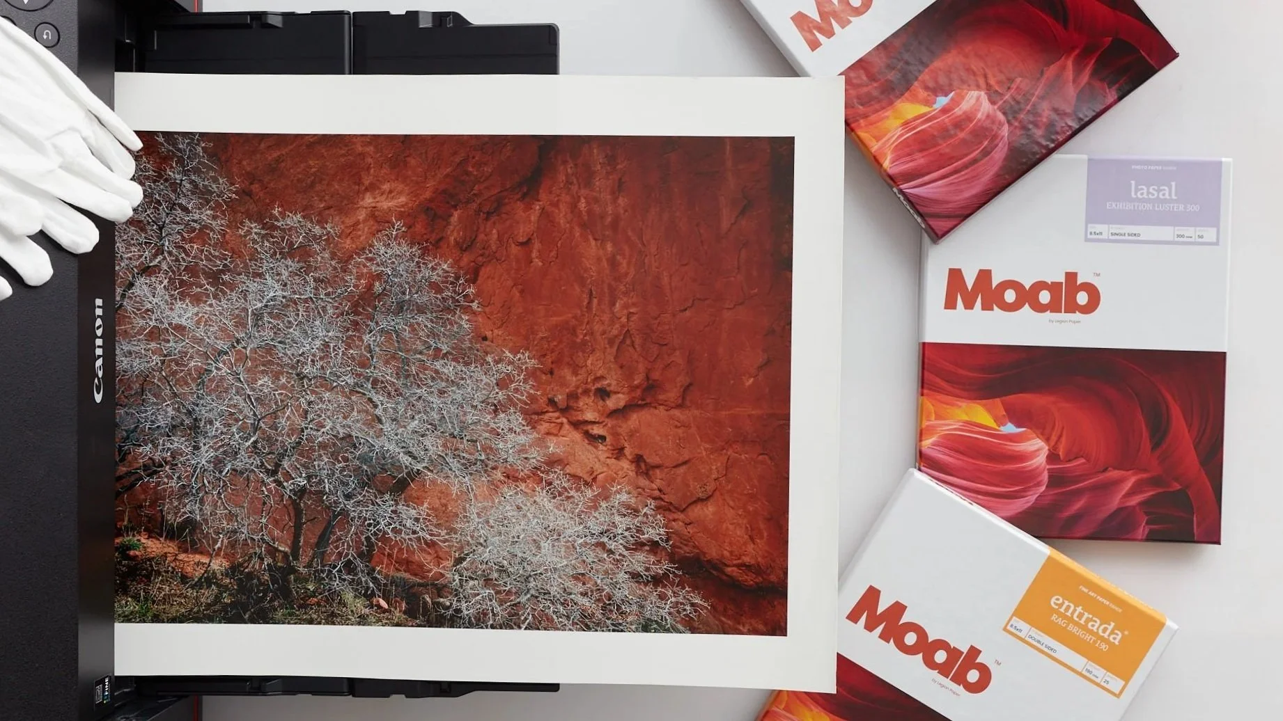
First and foremost - it can’t look just like your print, because a photograph, work of art, or even a plain piece of paper all use the qualities of reflective light, and the physics of light is completely different than that of backlighting. Neither of these links are for the faint of heart so here comes the layman’s version:
There are two main objectives that need to be accounted for: 1) the luminance difference between the paper that you print on and the brightness of your display, and 2) the color of white between your paper and your display. Your display profiling software asks you these things without you really knowing what they are asking. Here is what you need to do:
1) Start off with a D65 calibration and profiling process. Then match the color white of both inkjet paper and your display. If the display is too warm, adjust the Kelvin temperature of your profiling application downward to D55, D50 or a custom number (if you can do so). Most papers will have a good match for your lighting environment between D55 and D65.
2) Match the brightness of your display to the brightness of your inkjet paper. This is the tough one, because many people don’t have their display environment for their printed images anywhere near their monitor. Some profiling applications allow for a manual control over brightness, and the average range we have found is something around 100 to 120cm2.
Color management is a recipe no different than cookie recipes. If you leave one part of the recipe out, the cookie may look right, but it isn’t going to taste very good. The same goes for Color Management - make sure you have all the ingredients, including a room that is painted neutral gray, a light box in which to view your images under controlled lighting conditions or, no light other than your monitor in the room. If you only have some of the “ingredients”, your results are going to be frustrating.
That said, not everyone has the time, space or money to do this. If you need your monitor and your prints to look close, not perfect, and don’t want to spend thousands of dollars on measuring devices or invest the time in getting into the nitty gritty details of color management, than we recommend Aesthetic Color Management. This is the use of your eyes to determine what color should look like under your individual conditions. It works like this: when you get a good print that you like, take the print and put it up to your monitor and adjust the monitor to look like the print. It’s not very scientific, but you’d be surprised how accurate it can be.


